Q2. How effective is the combination of your main product & ancillary text? How well do they combine?
Typically when a new movie has been created and is ready to be released and viewed in cinemas, the production company will use multiple methods to ensure that their film reaches all audiences to advertise and persuade them to see their new film, this needs to be done as there would not be any awareness of he new film, and the profit would be poor. And so we have created a website, 2 posters and 2 magazines (Empire and Total Film).
Before I created my own magazine, poster and joint website I researched each one to find out what forms and conventions are used to ensure that when I created my own it had these conventions to ensure it was successful, and that word would get around about my product and that it is available in cinemas to see shortly. I researched each type of product and then created a sketch which I then later analysed to ensure that all the conventions were met, so that when I created my final products I knew what it was gong to look like and where to start, it meant that I did not forget about any conventions. When we created our website we had both done our own research and sketches and so with our combined knowledge it allowed us to create a unique website with a range of ideas displayed on the site, it also meant that we did not miss any conventions as we both and the understanding of what a website should look like and what it should contain.Below is the links and images of my sketches for my magazine, poster and website.
Poster
Research
Website
Research
Magazine
Research
Poster
Development
Website Development
Magazine
Development

Sketches
Magazine
Sketch
Website
Sketch


Poster Sketch
Posters & Magazines


Colour scheme that we have used.
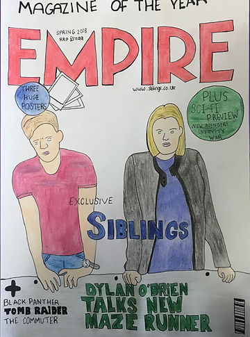
The main clear link between all of these is the photos that have been used , they feature the same characters in strong positions wearing the same clothes, and due to the costumes that have been chosen for them, particular colours have been selected to create the posters and trailer. You can see that blue has been taken from the male characters T - shirt (Sam) and red has been taken from the females dress (Lucy). We have tried to maintain a clear bold font to use in our posters and magazine, because in our trailer the style of the title and the way that it is presented, is transparent with the footage behind it, therefore making it hard to duplicate onto these product. Therefore, we chosen to do a clear bold font, with fonts matching in some products, we used 'Bell MT' both in one magazine and one poster to keep consistency. However we were limited to font choices as Total Magazine and Empire both have their own fonts and layouts and so we had to meet their conventions rather than our own and how we liked it, for example the empire website link is on the magazine rather than our own siblings website address which we would rather for more publicity.
We have maintained our production company logo, universal logo and the age rating logo in each product, as when researching we saw that this was an essential for each product as audiences could research into this and gain more information from it, they also need to know the age rating to know whether or not they can watch the film for audiences 18, ours is rated a 12A and therefore those who are 12 and not supervised by an adult or are younger are not permitted to watch the film. This needs to be made aware to audiences.
Survey
To ensure that the combination of our final product worked effectively together, I did a random survey to find out what people thought. I need to gain an audiences opinion to ensure that the audience could see that there was a strong link between our magazines, posters with the trailer. I asked my audience:
-
When viewing the poster could you identify what the name of the film was ?
-
Is the combination of posters and magazines clear it is for the one product?
-
When viewing the poster and magazine together what was the main link you could see between the two?
-
Based on the two posters would you want to see the film
-
Are the designs unique & creative, do they stand out from other posters, websites and magazines?
One of my survey questions was asking what the main link between the products was, which stood out to them the most, I got a variety of answers which was font, pictures, layout and headings , however the one that got the most votes was the pictures that were used, as we chose to use pictures taken in the same location however the stances of the characters are different to create different appearances and representation, the characters are also shown to be wearing the same clothes in each photo that they also wear in the trailer.
Another key feature that I asked my audience was whether the name of the film was clear on the products, this was essential because if the audience could not locate the name of the film then how would they know what film to chose to watch at the cinema or buy on DVD. We decided to be consistent with each title on each product so that there was similarity and the audience would know what to look for if they were looking at another product as the title would stand out with its consistency.


Website
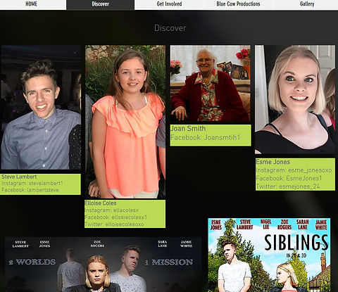
When we created out website we were sure to include certain aspects that audiences would be able to link to the other products, which include trailer, posters and magazine. The strong link between the trailer and the website, is that in the header bar the title design that is used in the trailer has been used in the header, create a clear link between the two as shown. On the home page of my website I have embedded the trailer from you tube, so people can view the trailer from the official website, which they can then research and learn more about the movie on the website. Our website is the only place where we can control what is seen by the audience as people cannot leave negative comments or any comments at all. The website is a collaboration of the final products and extras like social media sites for the film and for the actors, and it is where the audience can interact the most.
Another strong link between the website and the final product, is that the pictures featuring in the gallery section and in the header bar, are the same images that feature on our magazines and posters. Which when asking for audience feedback what they believed the strongest link between the two was, this is also applied to our website. However these images used in our ancillary tasks are not taken in the trailer, the characters are shown to be in the same location however, not in the same position, for these photos. Lucy is shown to be looking at a photo of her sibling trying to think of where she can find him, whilst Sam, the sibling is walking behind her minding his own business unaware of who she is. Making their characters seem oblivious and weak as they are missing the obvious, where as in the images they are shown to have a strong stance, where they feel that they can win the battle to get home.
Cross Media Convergence
Our product links together to create a cohesive promotional package by using cross media convergence and synergy. We have included our website address in as many forms in our products so that audiences can communicate and use as many forms of social media to find out more about the film. Synergy has been used so that our film reaches across to all audiences that would be interested in our film. We synergised with Universal pictures due to their large budget that they have available to ensure advertising is efficient. and the working together of the cross media convergence and synergy ensures that the promoting of the film is done correctly.
We used web 3.0 which enabled us to use cookies so that we could track our audiences so that we could see how users are interacting online. With this new information we can find out what works well in advertising and so we can change the way during the process of the release date so that we cover a wider range of audience.